Wingstop Charities Redesign
Aided in the redesign of the Wingstop Charities homepage, highlighting their 3 core programs and lightening up the site.
About the Project
During my internship with Bounteous, I worked with a team of designers, a project manager, and a client to redesign the Wingstop Charities homepage. The client wanted to display their core programs better, as well as lighten website's the color scheme.
For this project, I dabbled in both UX and UI roles. I conducted research, drew wireframes, and created high-fidelity mockups.
Research
I kicked off the project with a site map of the original website, finding that the existing flow did not display crucial information in an easy to read way. For the homepage, links to each of the organization's programs existed, but the information was mostly accessed through the nav bar. The remaining site consisted of several links that took the user to the same place, as well as a lack of hierarchy.
Brainstorming
With our goals in mind, we started collecting inspiration with a mood board. We wanted to use imagery in a unique way, add in pops of color, and keep the homepage simple yet interesting.
Wireframes
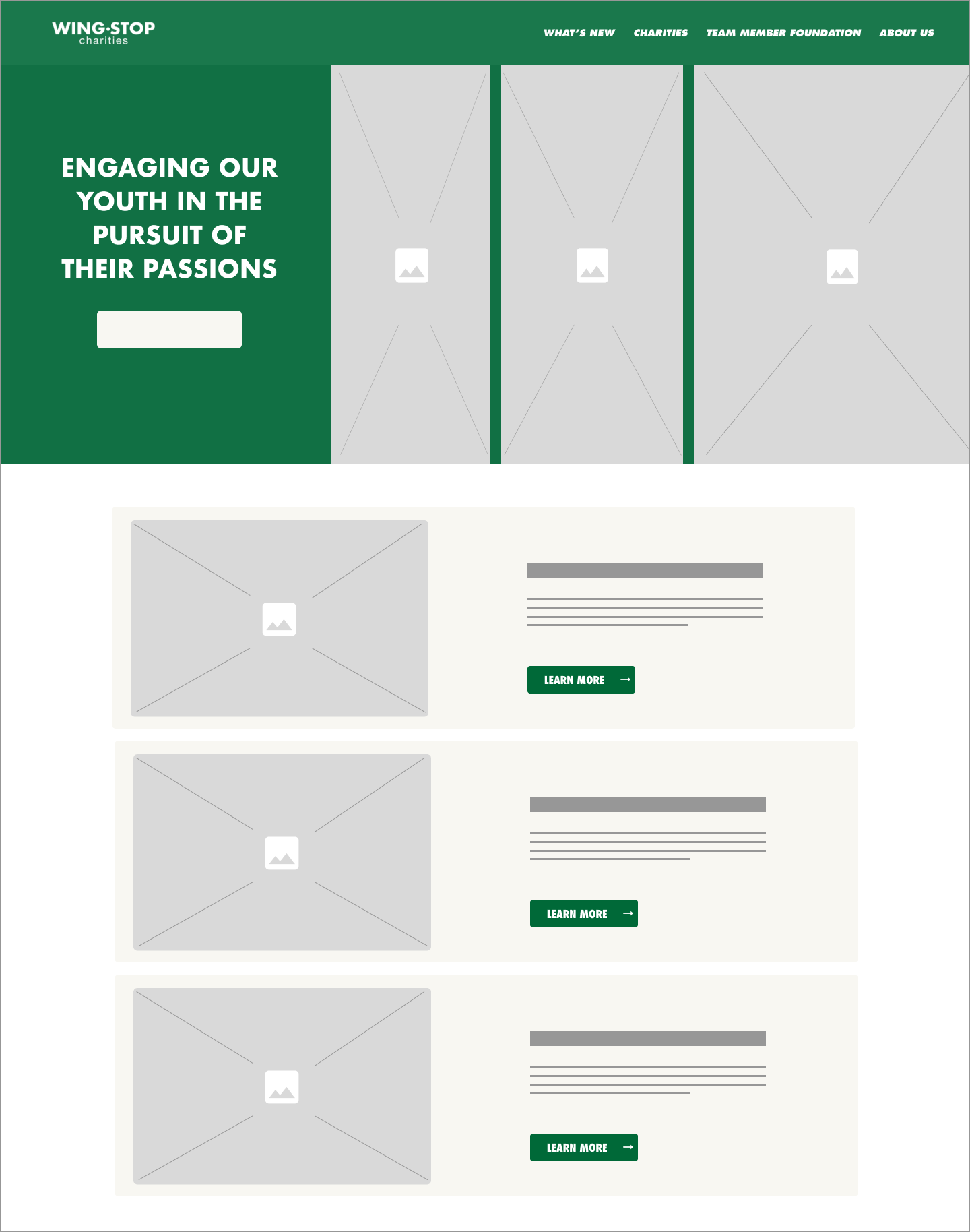
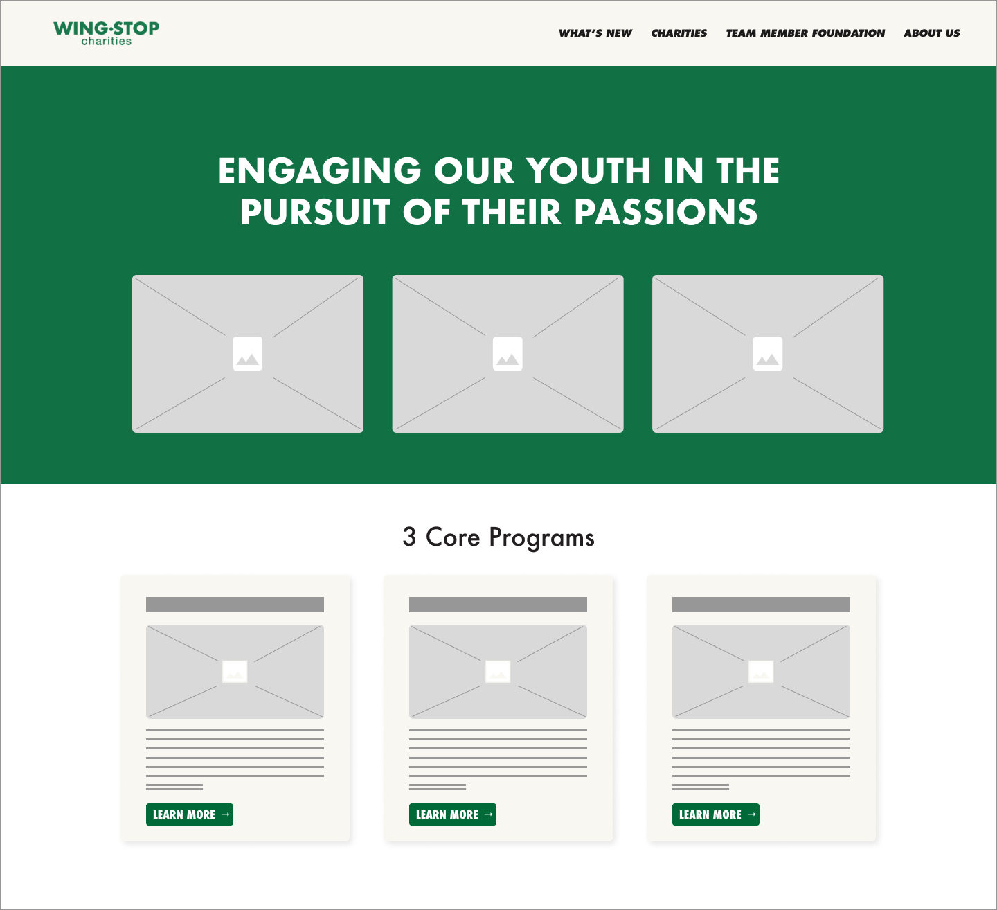
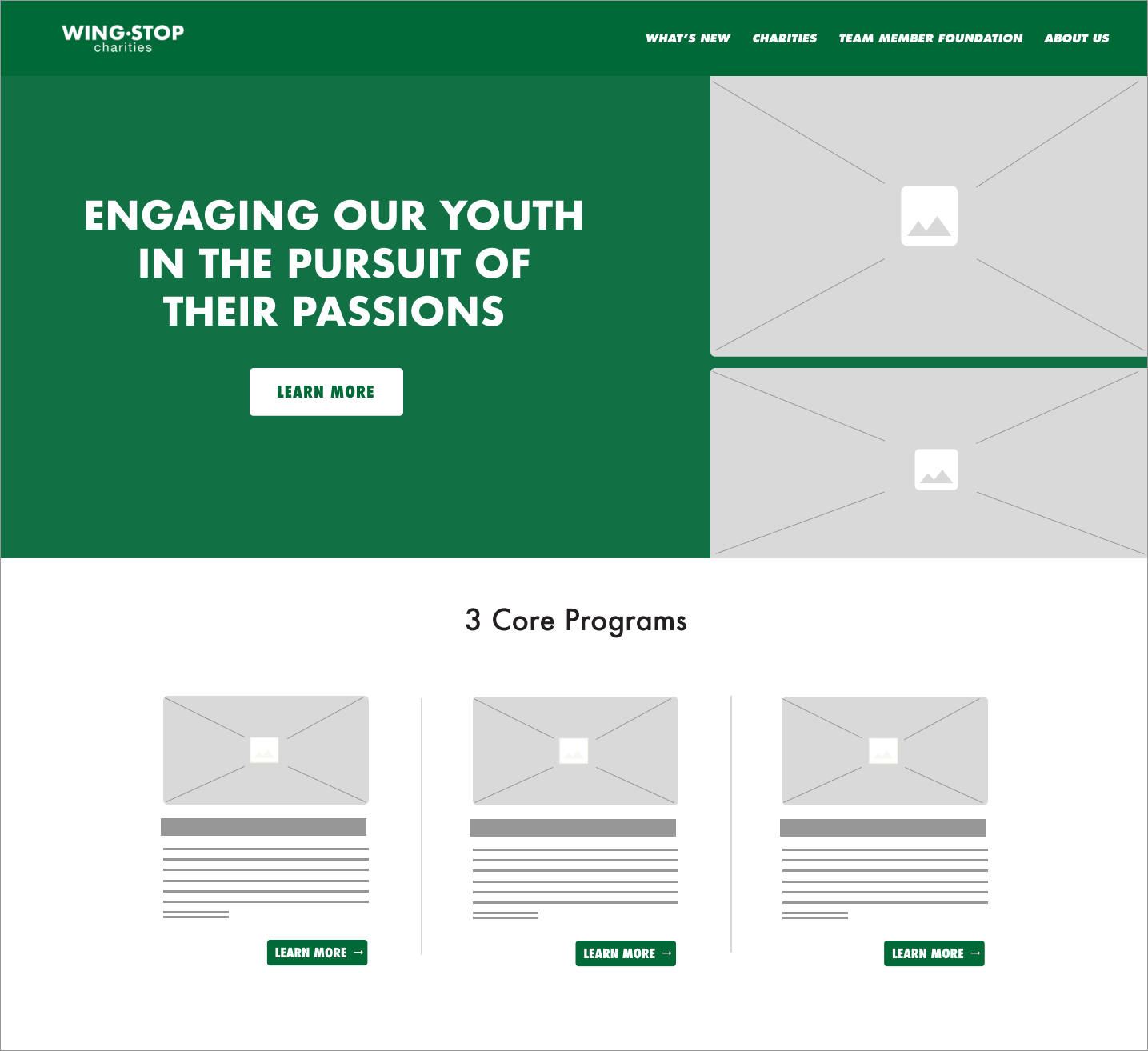
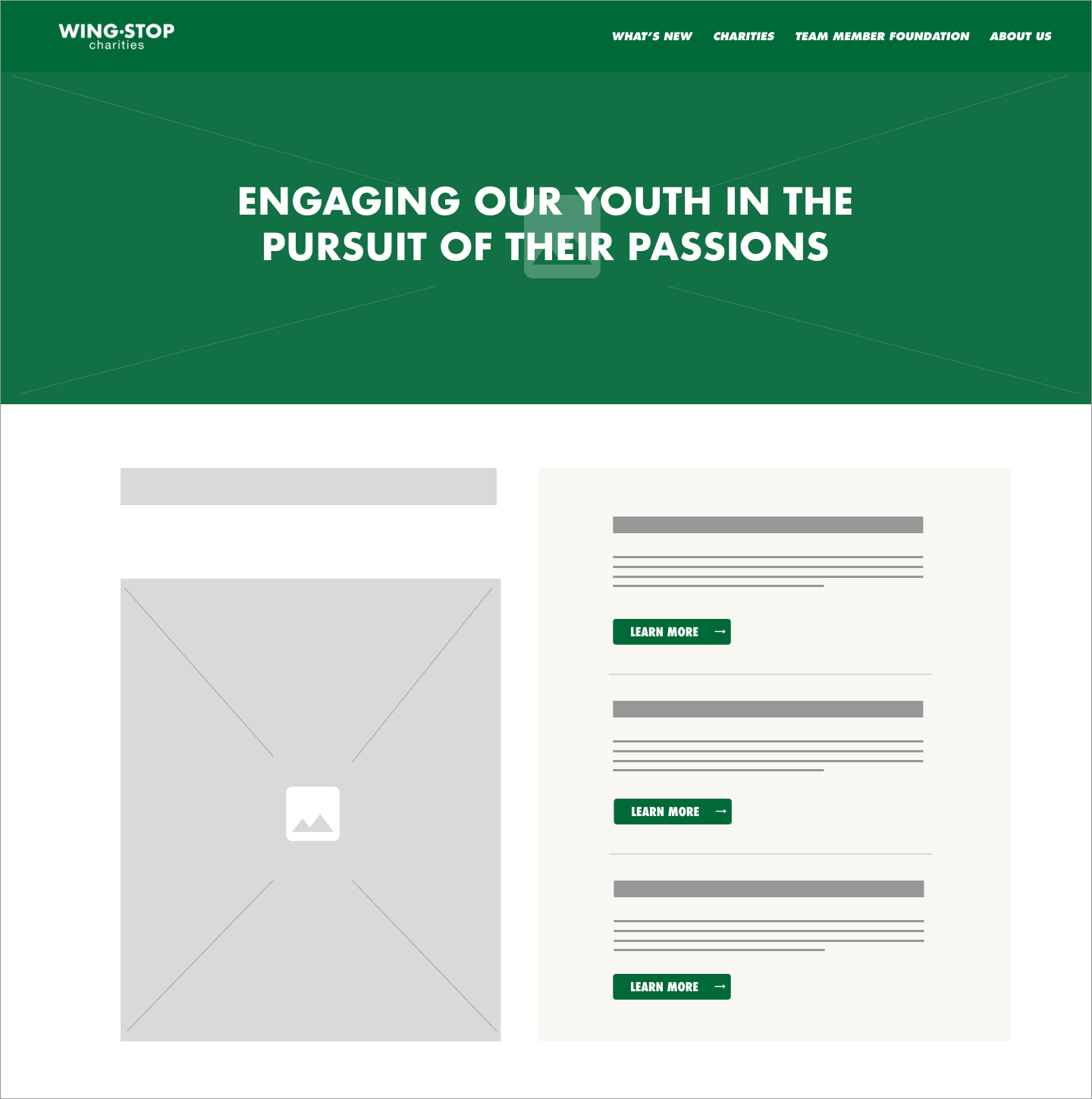
Our 4 solutions to better highlight Wingstop Charities' 3 core programs:
1) Repurpose the existing hero carousel to highlight the 3 core programs, one per slide.
2) Replace the Home Page Carousel with 3 panels, showing the programs simultaneously.
3) #2 + a static banner at the top of the home page to display the mission statement.
4) Static banner at the top with an interactive element cycling through the 3 core programs.
Low Fidelity Drafts
High Fidelity Drafts
We presented options to our client, letting them mix and match elements from each draft into the final design
Final Output
The client chose this direction, as they liked the light color palette, organization of information, and unique imagery. The photography we were given was outdated, so we were able to find a way around using these photos in our final output. The 3 core programs are clearly laid out and the icons associated with each program tie the statistic section together with the top half of the page.
In the future, we hope to update the remaining pages with this theme and get rid of the dense, dark elements.
