
Fitbit Application Redesign
Redesigning the Fitbit app to be more user-friendly, concise, and easy to navigate.
Why Fitbit?
Fitbit is a leader in health and fitness apps. It seamlessly allows users to track their workouts, sleep, nutrition, and stress, all through wearing a Fitbit smartwatch or tracker. However, this app can improve both in terms of how it functions and how a user feels while using it.
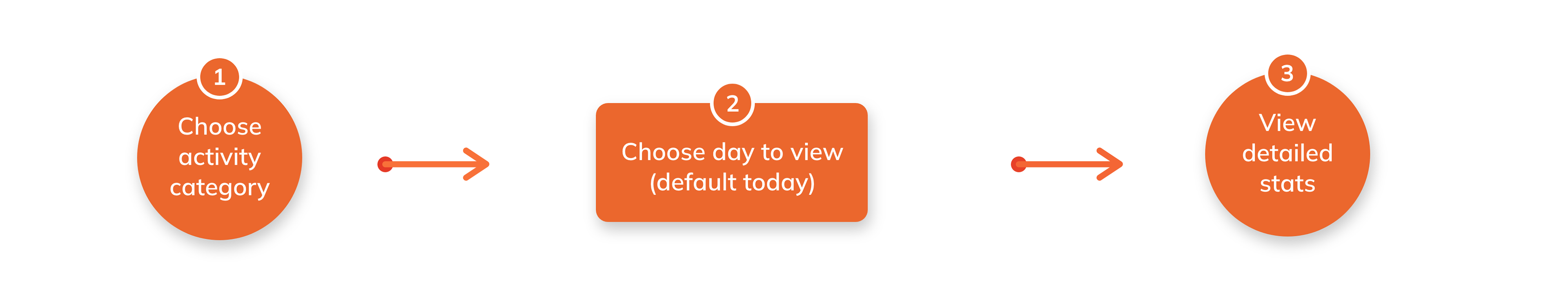
Main Task: Track all activity stats
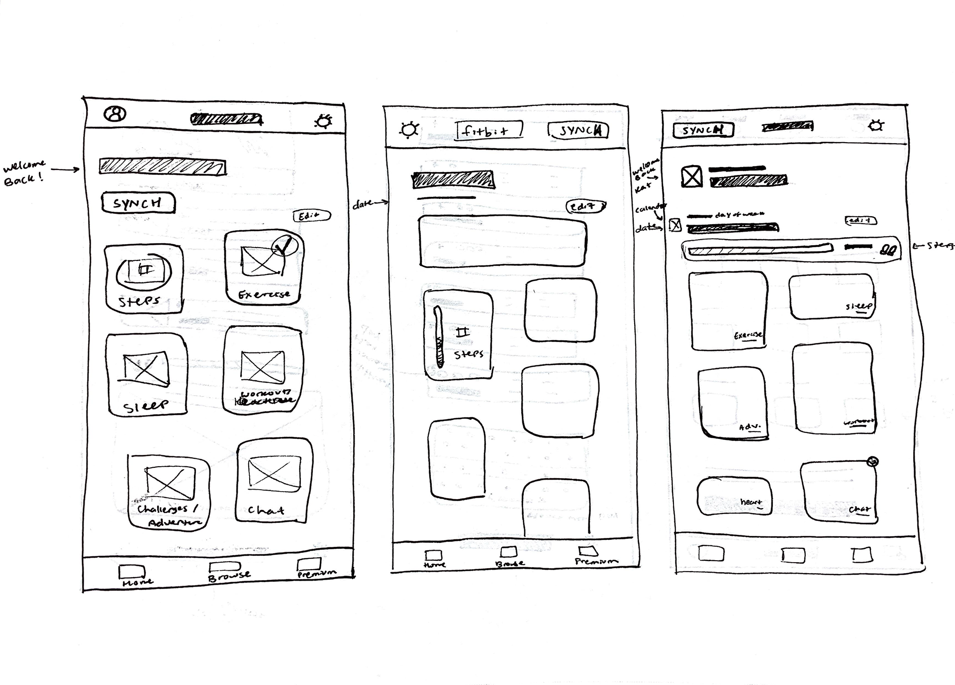
Existing Task Flow
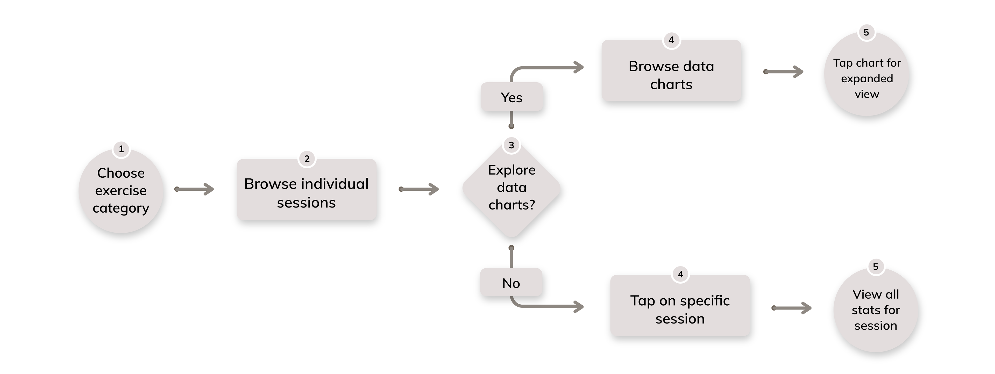
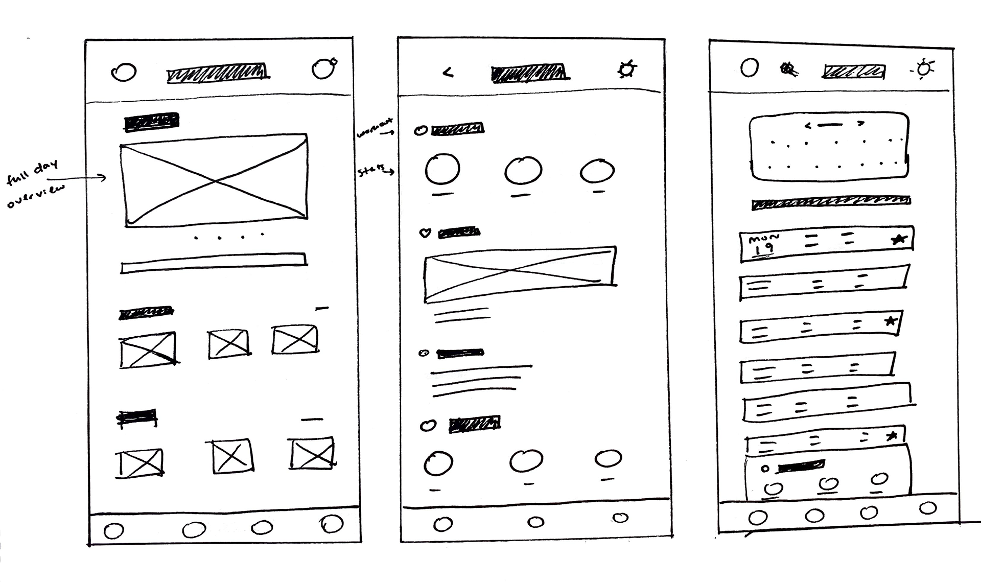
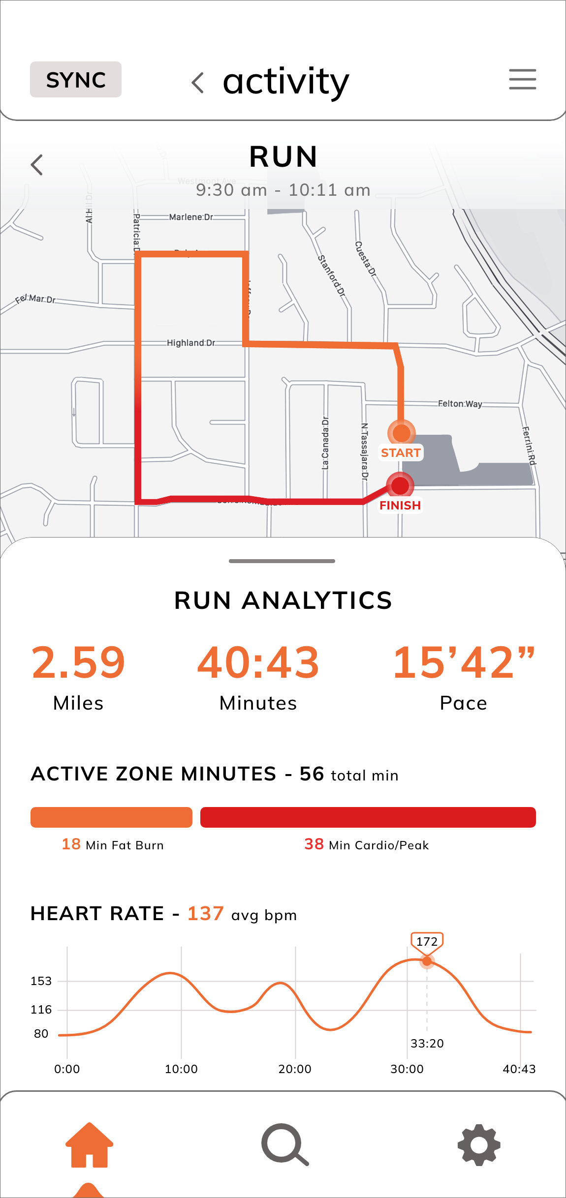
New Task Flow
User Persona
Elizabeth Jones is a high school English teacher who is based out of San Diego, California. When she’s not grading papers or driving her son to soccer practice, she loves to hike, run, and play with her dog. Elizabeth values a healthy lifestyle in order to keep an eye on her cardiac arrhythmia, prevent any future health issues, and set a positive example for her family.

Demographics
Income: $87,000
Education: Masters degree
Marital status: Married, One son
Health conditions: Cardiac arrhythmia, breast cancer runs in family
Ethnicity: Hungarian, Italian
Income: $87,000
Education: Masters degree
Marital status: Married, One son
Health conditions: Cardiac arrhythmia, breast cancer runs in family
Ethnicity: Hungarian, Italian
Behaviors
Checks sleep quality each morning
Analyzes performance of mid-afternoon workout
Sets fitness goals once a month
Checks sleep quality each morning
Analyzes performance of mid-afternoon workout
Sets fitness goals once a month
Wants and Needs
Track heart rate throughout the day
View body’s response to workouts
Log amount of rest received
Track daily steps at work versus at home
Obtain daily data to show medical professionals if necessary
Privacy to protect personal and professional life
Track heart rate throughout the day
View body’s response to workouts
Log amount of rest received
Track daily steps at work versus at home
Obtain daily data to show medical professionals if necessary
Privacy to protect personal and professional life
Does Not Want or Need
Excessive scrolling
Cluttered data which takes substantial time to sort through
Pay for another subscription service
Excessive scrolling
Cluttered data which takes substantial time to sort through
Pay for another subscription service
Wireframe Sketches
I took into account user reviews and my pain points to come up with various possible layouts for a home screen, exercise tab, and specific workout data.
Digital Art Drafts


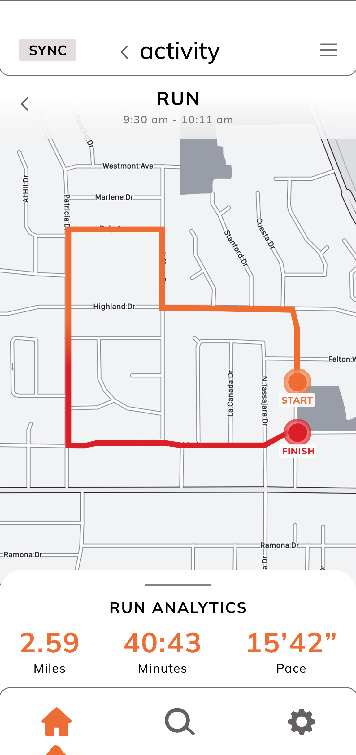
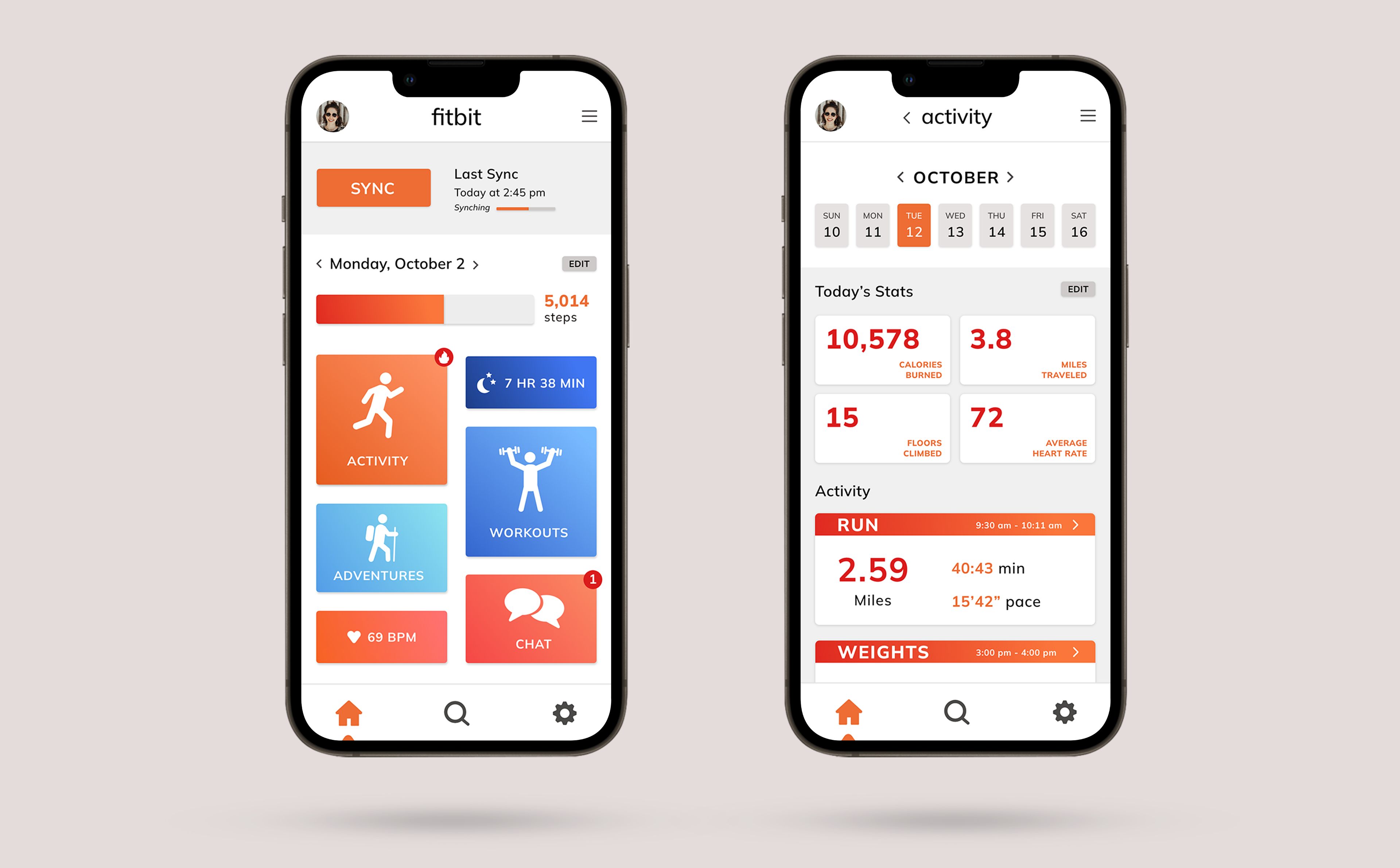
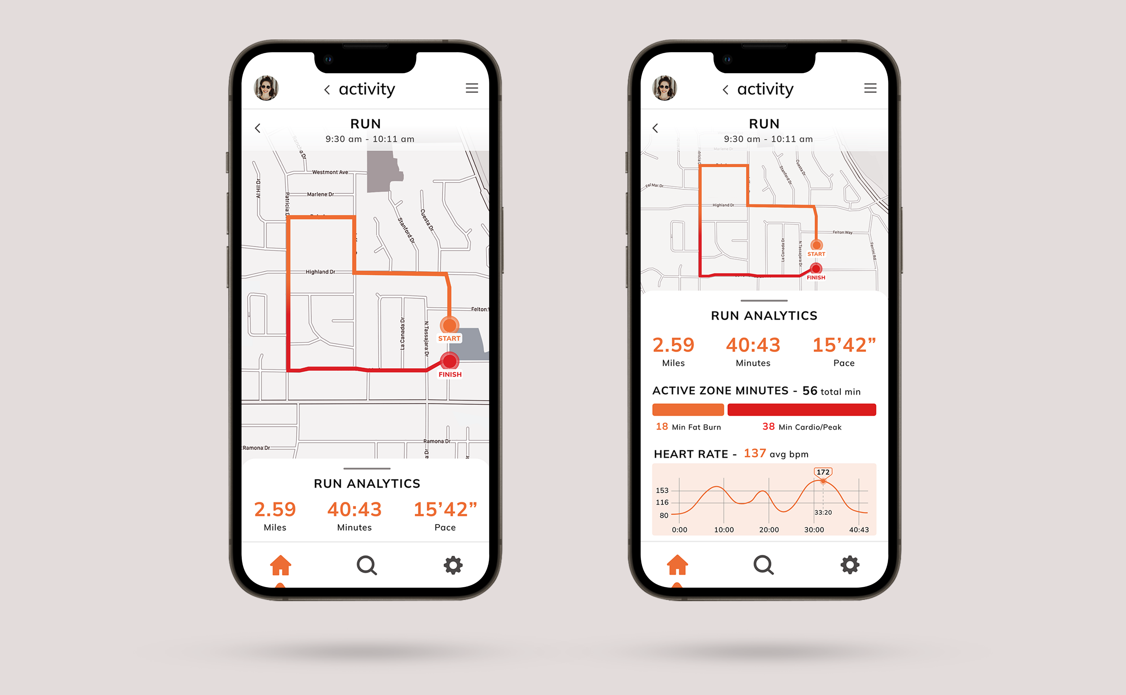
Final Screens
I received feedback from my digital drafts to add larger blocks of color, create more depth on the home screen, and to edit the navigation bar containers. One of the most common user complaints about Fitbit is how the sync function is glitchy and not designed well. Since this is one of the most important features, I decided to make this function more prominent on my final screens.